Intuit Quickbooks Self-Employed
Intuit Quickbooks Self-Employed
I'm Susan, and happy to meet you.

Intuit Quickbooks Self-Employed
Work samples

Handshake is a fictional app that connects freelancers and business owners to help make doing projects together easier. The primary functions of the app are billing, payments, project tracking, and communication.
THE problem
Before a design review, I was sent mockups for screen flows for two user types. I was asked to update content and evaluate the UI to help get the app ready for review and as close to release-ready as possible.
The Challenges
-
Define word usage and brand voice.
-
Edit in-app text for the entire user flow (sign up, project set up, ongoing use, messaging screens, and micro-copy).
-
Evaluate flow for possible user friction; suggest new information architecture and hierarchies.
PROJECT OVERVIEW
gaining user empathy
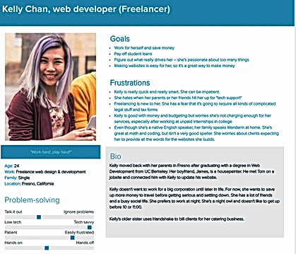
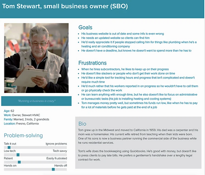
To get started, I evaluated two user personas given to me by the research team. This helped me understand Handshake's user types to help start forming the product's voice and tone.
I created user stories from the personas to understand their challenges. Kelly is a tech-savvy freelance web developer. Tom is a small business owner who uses technology only when necessary but is open to learning new things if it will help get the job done more efficiently. Tom hired Kelly to redesign his business website.
Freelancer problems:
I am a designer who uses apps to manage my freelance projects.
I am trying to do all of the right things to run my business and to maximize my time.
But, I really don't like administrative tasks, and dealing with "business stuff."
Because I'm afraid of all of the complicated administrative tasks, and I'm worried that I'm not not charging enough.
Which makes me feel like I don't know what I'm doing.
In a perfect world, I'd like to make it easy manage my freelance job, and be perceived as professional.
The biggest benefit to me is it will help me feel confident .
Which makes me feel like I take on more work and will help me reach my long term business goals.
Freelancer ideal state:
Small business owner problems:
I am a small business owner who wants a tool to manage the projects that I have going on simultaneously.
I am trying to stay on top of the work that I've outsourced.
But, I find that I really don't have time micromanage numerous jobs.
Because I'm busy with my own projects and don't like to focus on administrative tasks.
Which makes me feel like I'm not maximizing my time and focusing on the the things that I want to.
Small business owner ideal state:
In a perfect world, I'd like to see the status of my projects without without taking a lot of time to do so.
The biggest benefit to me I'll be able to focus on my own projects and spend less time managing those that I've outsourced.
Which makes me feel more satisfied by the work that I get to do.
Task and terminology analysis
To help create the product voice, I expanded the user personas by considering the types of tasks that each user would perform independently and those where they'd intersect. I also looked at other apps that had analogous features to see what words that Tom and Kelly might use. Despite the user's different perspectives, a common vocabulary began to emerge.
Tasks
Freelancer tasks
(primary user)
-
Provide pay rate
-
Estimate hours to complete project
-
Request and track payments
Business owner tasks
(secondary user)
-
Provide project details
-
Approve/reject budget
-
Send payments
Shared tasks
(both user types)
-
Messaging
-
Tracking hours and budgets
-
Tracking payments
-
Send project invitation
Terminology
Proposals
Estimate
Proposal
Contract
Expenses
Retainer
Budget
Scope
Quote
Statement of work
Payments
Payment
Expenses
Rate
Invoicing
Terms
Direct deposit
Billable hours
Mobile payment
Cost
Tracking
Time
Project timeline
Expenses
Milestones
Project timeline
Communication
Updates
Progress
Schedule
Process
voice and tone: Creating a mini Style guide
With a better understanding of our user's journeys, tasks, and needs, I started to define the product voice and tone.
Guiding principles
After analyzing personas, tasks, and competitors, these were my takeaways to help create guiding principles for the content used in Handshake:
-
Consider both user types
Where experiences intersect, copy should address both user roles; freelancers and business owners.
-
Simple language
Terminology needs be understood by both user types with varied levels of technical savvy. Content choices need to be jargon-free to ensure users feel empowered rather than intimidated.
-
Consistency
Using the same words throughout the experience, users will become more familiar and therefore trusting of the app, and its ability to help manage their business.
Voice attributes
Voice and tone need to work for users that are new business world and/or technology. Giving users the confidence needed to keep moving through the task at hand, and forward to meet their business goals.
Friendly
Handshake is like a trusted friend; with you when you get to the hard stuff.
Reliable
Handshake helps you with your business. Count on us to help keep your project on track.
Supportive
Handshake makes your life easier. We think about the little things so you can do the things you love.
Preferred terminology
After completing the above tasks, I made a list of preferred terms to further shape the product voice and start to form the app’s style guidelines.
Freelancer
Freelancers are employed for short-term and specific projects. Contractor can also mean someone that works in the construction business. Use instead of self-employed, contractor, or 1099 employee.
Business owner
Use instead of entrepreneur, CEO, or business person.
Hours
Refers to the hours worked, or approved. Freelancer's time worked is tracked as hours, not weeks.
Invoice
Use hen referring to payment documentation, freelancers should not be limited by a time frame. Freelancers are not tied to weekly timesheet submissions as permanent or long-term contractors may be. Use instead of weeks.
Project
Use to refer to the work that's being done. Use instead of gig, job, or engangement.
Rate
Refers to the agree upon hourly pay for the freelancer. Scalable for future Handshake iterations that may include projects that will be a "flat rate". Use instead of pay, or dollarinies.
high-fidelity Mockups
Interaction review
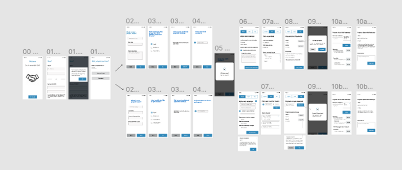
Before getting into the nitty-gritty of creating content for each screen, I evaluated the interaction for the entire app. My evaluation included suggested changes to the information architecture, new screens and tasks, and revised task hierarchies.
* I was tasked with evaluating the entire experience, but for this case study, I'm concentrating on the setup screens.
Before
Setup screens
After

Setup screens
Synthesis & Solution
Process
High level evaluation of setup flow interaction
Before
Problems:
-
First-time and returning users share the same experience, causing redundancies and missing information simultaneously.
-
Interaction elements and navigation are confusing and imply an expectation that is different than what occurs.
-
Multiple functions for both user types on one screen create an increased cognitive load.

After
Solutions:
-
Reduced cognitive load by decoupling and creating separate flows for first-time and returning users. Creating two flows allows for content specific to the different user types and where they are within the experience. Also, separating the flows will result in better usability since it will limit the choices and inputs for both user types.
-
Created a carousel to onboard first-time users to help with discovering product features. This is a pattern that first-time users are experienced with and what they'd expect when signing into an app for the first time. Adding the carousel creates user trust and confidence.
-
Moved project role intake from the project flow to the setup flow since the role is tied to the profile, not the project. This results in users not having to re-enter information for each project.

My next task was to help users understand the benefits of the app and instill confidence in their actions throughout the experience. Ready with the product voice and preferred words, I created content for the design review to get the app as close to being to customer-ready as possible.
Setup screens: first-time users
Before

Problems (new users):
-
What is this?
No product name.
-
What can I do here?
No indication of what the app does.
-
Where am I?
No context for where users are within the experience.
-
What do I do next?
Only one choice, with no indication of what happens next.
After

Solutions:
-
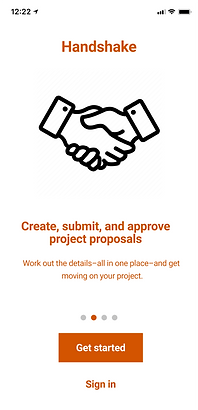
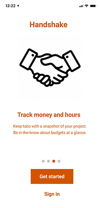
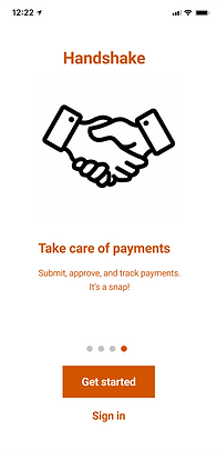
Created content to orient users, most importantly the app's name.
-
Described the app's features and benefits. Used product voice with supportive, reliable, and friendly content to help and encourage first-time users. "Create", "track", "approve", and the promise of organization all speak to user's need for a little hand-holding so they feel Handshake will help them stay organized and on top of their business.
-
Spoke specifically to new users with "Get started" CTA, encouragement for new users to create an account.
-
Acknowledged returning users by creating the ability to sign in on any page of the carousel, or opt out of seeing information that they don't need, which creates the sense that they're in control of their path and have choices.
-
Used sentence case to create casual, clean, and easy-to-read content that feels conversational.
First-time user sign up flow
Before

Problems:
-
Header doesn't give any user guidance.
-
Ghost text is used inconsistently and in lieu of field labels.
-
All caps are used and are inconsistent.
-
No confirmation for first-time user email input.
-
Multiple functions for both user types on one screen create a cognitive burden and poor usability.
-
Voice and tone are inconsistent.
After


Notes to designer: Can we add a mechanism to unmask the password to be more accessible here?

Notes to designer: Do we have a component for password verification? Here’s some content for the meantime.
Solutions:
-
Added clarifying headers so users can clearly identify where they are and what they are being asked.
-
Used parallel construction for headers to create consistent language and clarity.
-
Removed ghost text and added field labels.
-
Simplified password requirement text, and used sentence case instead of all caps. NO ONE WANTS TO BE YELLED AT!
-
Created a new screen to separate email address and password entry for enhanced usability on small screens. Giving space between each action reduces cognitive load, and minimizes errors and user confusion from asking for too much information in a small space.
-
Decreased user anxiety by adding navigation options.
-
Suggested email confirmation screen to ground and assure users. The content re-affirms the notion that "we've got your back", and that users can trust the process that's unfolding.
Before


Problems:
-
Actions on these screens are out of sequence. Either the confirmation comes before the final step of the set up, or the role selection screen is a part of the next flow. Either way, this needs clarification.
-
Navigation is unclear and disorienting. Even if the order of the screens were flip-flopped, the user ask doesn't correlate with the UI elements.
-
The overall flow does nothing to humanize users, which is key to facilitating a business relationship.
-
Issues with tone and spelling.
After

Solutions:
-
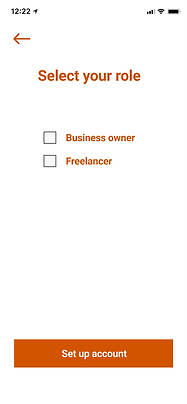
Solidified placement of the role selection screen to create a more logical sequence, which eliminated the need for this step during each project set up since it’s tied to the customer profile rather than a project. Assuming that in most use cases the user would never switch their role from “Business owner” to "Freelancer”, so would only need to be established one time, upon account set up. In the edge case where the roles are switched, the user would likely need to set up a separate account, or need we could create an additional flow for that possibility.
-
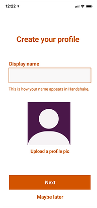
Created a new screen for users to make a profile to help humanize interactions within the app. They can create a "display name" and are reminded that this is how they'll be known throughout the app, and assuring them how and where this information will appear.
-
Changed UI element from buttons (that lead users to believe that they were to be taken somewhere, but in fact, it asking them to make a selection) to a check box, which indicates making a choice.
-
Moved the account set up confirmation to the end of the flow. Created CTA to encourage users to continue into the project flow, clarifying where they will be taken within the experience. Also, "Later" reassures they can stop at this point and come back later to set up their project.
-
Used parallel structure to clarify the function of the screens and eliminated confusing language.
-
Added clear navigation options to the profile screen including "Maybe later", which lets users know that they can do this now, later, or not at all; and move them to the next step of the flow.
-
Flexed tone on the confirmation screen to recognize the user's milestone within the flow; an affirmation that this part of the process is complete, and now they can move on to what they came for.
Next steps:
If there were next steps for this fictional app, I'd take the most complex content problem that I may need help with or feedback on to my weekly peer review session. If time allowed, I'd consider usability testing and gathering data to bolster design rationale before the final design review.
Handshake was the final project of my UX Content Collective UX Writing Fundamentals certification. Here's what the course instructor had to say about my project:
Instructor feedback:
Project score: 22.5/20 Outstanding!
Extra points for solving additional usability issues
Instructor comments:
Your level of effort, time spent, and conscientiousness in regards to the user are noted. The app flows much more logically, aided by your extra microcopy tips. I loved reading through your design rationale and your proposed solutions—there are a lot of great ideas in here that you’ve explained or mocked up really well, and most importantly, you’ve reasoned out their importance and how they help the user.
-
You have an eye for making the experience as smooth as possible for users. You thought about everything from accessibility concerns to future iterations that would add nice-to-have advancements. Your rationale was always diplomatic and collaborative—keep it up, it’ll serve you well on the job!
-
I loved the way you reformatted tables and charts in ways that were more scannable and neat for users to understand.
-
You added helpful microcopy right onto the screen to fill in gaps and provide more context. They were reassuring and thoughtful.
-
Excellent attention to many tiny details, like the missing business owner screen’s payment method and currency formatting.
-
Thanks for going above and beyond by creating new screens and flows that showcased your growing skill set and always advocated for the user.
Returning user sign in
Before


Problems (returning users):
Returning users need to have a separate sign in flow from the first-time users experience for:
-
Expedience
-
Avoiding repetition
-
Getting to tasks quickly
Additional issues are addressed above.
After


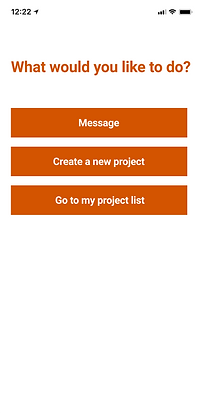
Notes to designer: Can we add the standard password recovery component?
Notes to designer: Can we use iconography to indicate new messages and help with the overall scanablity of this page?
Solutions:
-
Decoupled the first-time user experience and returning user flows (as outlined above).
-
Wrote content specifically for returning users where they are within the experience.
-
Focus on what's relevant to returning users, giving them the option to go directly to a new project, existing project, or message center.

